The Design > Cookie Banner page in Secure Privacy gives you full control over your cookie consent banner's appearance — including position, padding style, custom CSS, colors, and button styling. This guide walks through every available design setting so you can create a banner that matches your brand and provides a clear consent experience for visitors.
Who Is This For?
Website administrators and designers customizing the Secure Privacy cookie banner appearance
Developers applying custom CSS or advanced color configuration to the consent banner
Compliance and UX teams ensuring the cookie banner is visible, accessible, and brand-consistent
How to Access Cookie Banner Design Settings
Log in to your Secure Privacy account and navigate to Design in the dashboard. Select the design you want to modify, then open the Cookie Banner section to access all available customization options.
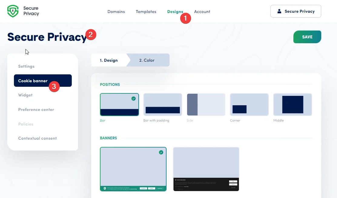
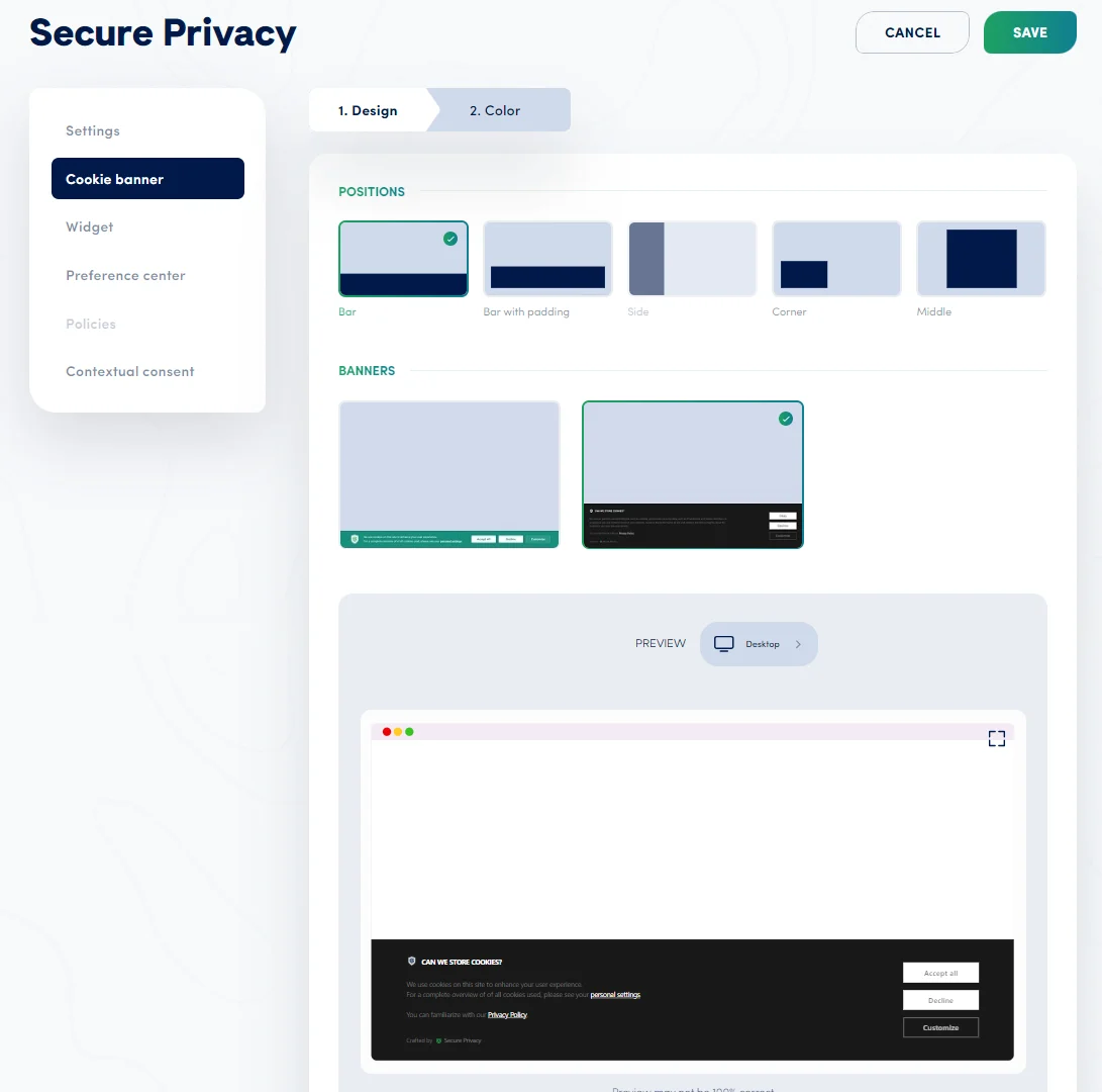
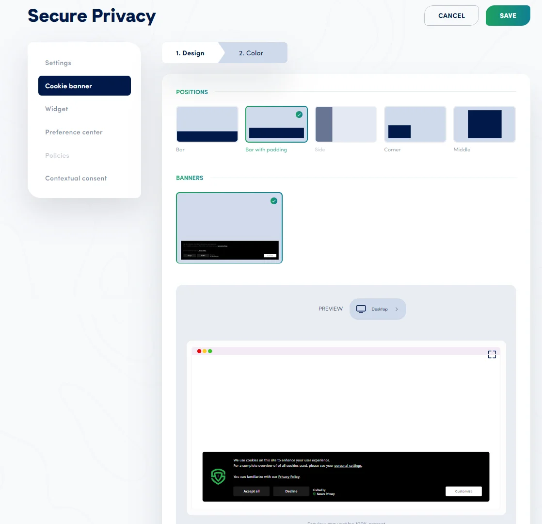
Banner Position Options
Secure Privacy provides several pre-defined banner position designs — each can be customized further using the color and CSS settings below.
Bar Position
The bar position displays the cookie banner as a horizontal bar across the top or bottom of the viewport. Two bar design variants are available, balancing visibility with a clean, non-intrusive appearance.
Bar with Padding
The bar with padding option adds spacing around all sides of the banner, giving it a floating, elevated appearance that draws attention without covering page content.
Corner Position
The corner position places the banner in a corner of the viewport — unobtrusive and easily spotted. This option integrates naturally into most website layouts without interrupting the main content area.
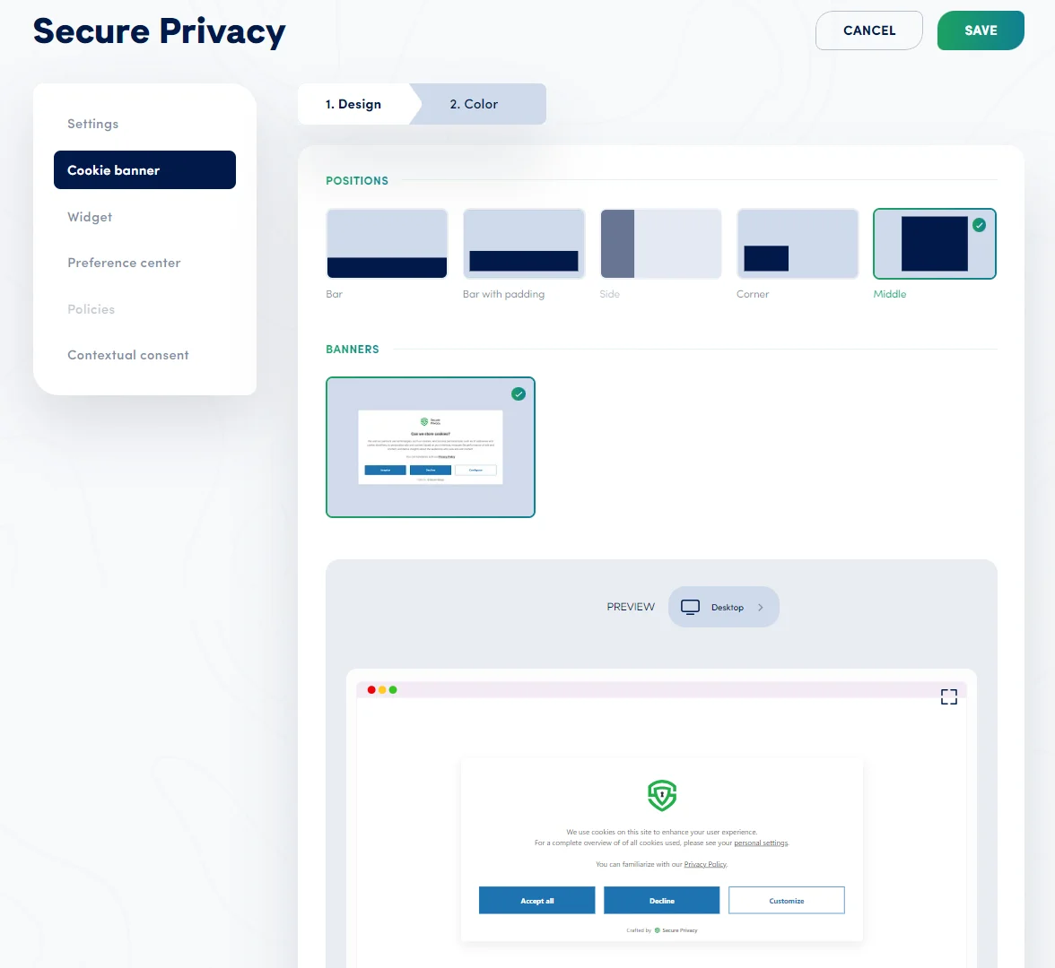
Middle Position
The middle position places the banner as a centered overlay on the page — highly visible and ideal for designs where consent must be clearly acknowledged before the visitor continues browsing.
Advanced Customization
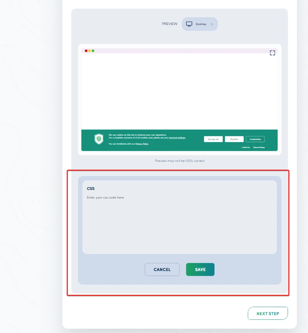
Custom CSS
For full design control, apply custom CSS to the cookie banner. Custom CSS lets you override or extend default styles — adjusting layout, typography, spacing, animations, or any other visual property to match your website's design system precisely.
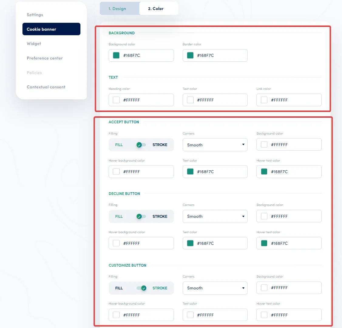
Color Settings
Adjust banner colors to match your brand palette. Available color controls include:
Background color
Border color
Text color — headings, body text, links, and hover states
Accept, Decline, and Customize Button Styling
Each consent button — Accept, Decline, and Customize — can be styled independently. Available options include:
Fill style: Filled background or stroke (outline) only
Corner style: Smooth, sharp, or rounded corners
Colors: Background color, hover background color, text color, and hover text color — configured separately for each button
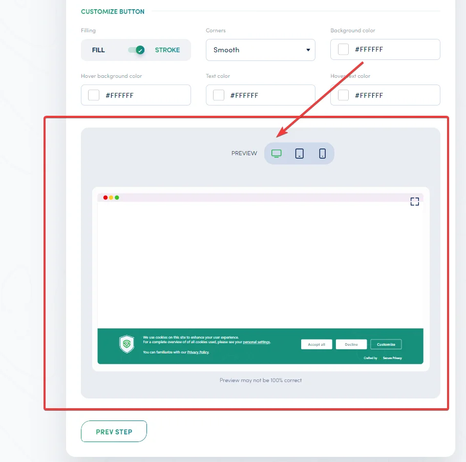
Preview
Before publishing your design, use the preview feature to see how the banner will appear on desktop, tablet, and mobile devices. Switch to full screen for the most accurate visualization. Note that the preview provides an approximate representation and may not be 100% identical to the live banner on all browsers and devices.
Frequently Asked Questions
Can I use a different position for mobile vs. desktop?
The banner position setting applies globally across all devices. To apply device-specific positioning, use custom CSS with media queries to override the default positioning for specific screen sizes.
Will custom CSS override all default banner styles?
By default, custom CSS is applied on top of the existing banner styles — only the properties you specify are overridden. To replace all default styles entirely, enable the Replace Default CSS option in the Custom CSS settings. Use this only if you are supplying a complete custom stylesheet for the banner.
Can I style the Accept and Decline buttons differently from each other?
Yes. The Accept, Decline, and Customize buttons each have their own independent styling controls — including fill style, corner style, background color, hover color, and text color. Configure each button separately to achieve the visual hierarchy you need for your consent UI.