Summary: A well-designed contextual consent page builds user trust, reinforces your brand identity, and improves consent interaction rates. This guide explains how to use Secure Privacy's Contextual Consent design editor to customize background colors, text, button styles, and custom CSS — ensuring your consent overlay is both visually consistent with your site and compliant with WCAG accessibility standards.
Who Is This Guide For?
- Website administrators and designers customizing the visual appearance of Secure Privacy's contextual consent overlay
- Developers applying custom CSS to fine-tune consent page styling beyond the visual editor
- Marketers and compliance managers ensuring the contextual consent page reflects brand identity while meeting GDPR design requirements
How to Access the Contextual Consent Design Editor
To begin customizing your contextual consent page design in Secure Privacy:
- Log in to your Secure Privacy account
- Click Design in the dashboard navigation
- Select the design template you want to preview or modify
- Navigate to the Contextual Consent section within that template
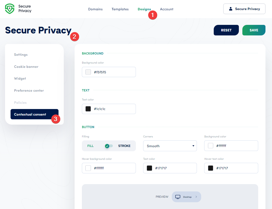
Contextual Consent Design Configuration Options
Reset to Default Settings
The Reset option reverts all design changes back to the Secure Privacy default settings. Use this if you want to start fresh or undo customizations that aren't working as intended — without needing to manually undo each individual change.
Background Color
The background color sets the visual foundation of your contextual consent overlay. Choose a color that complements your overall website theme while ensuring strong readability for the text layered above it. If your site uses a light theme, a light banner background with dark text typically performs best for both aesthetics and accessibility.
Text Color
Select a text color that provides strong contrast against your chosen background. WCAG 2.1 AA requires a minimum contrast ratio of 4.5:1 for normal body text — meeting this threshold ensures your consent message is readable for users with visual impairments as well as in bright ambient light conditions. Use the WebAIM Contrast Checker to verify your color combination before publishing.
Button Design and Color Settings
Each consent action button can be fully customized. The following options are available:
Fill style: Choose between a Filled button (solid background color) or a Stroke button (outline only) to match your site's design language.
Corner style: Select Smooth (rounded), Sharp (square), or Round (pill-shaped) corners to align with your brand's visual identity.
Background color: The button's resting state color — choose a color that clearly signals its function (e.g., green or blue for acceptance, neutral for decline).
Hover background color: The color shown when a user mouses over the button — should provide enough visual change to signal interactivity.
Text color: The label color on the button at rest — ensure strong contrast against the button background for readability.
Hover text color: The label color during hover — maintain contrast with the hover background color.
GDPR reminder: Under GDPR, the "Accept" and "Decline" buttons must be equally prominent. Avoid styling that makes one option visually dominant over the other.
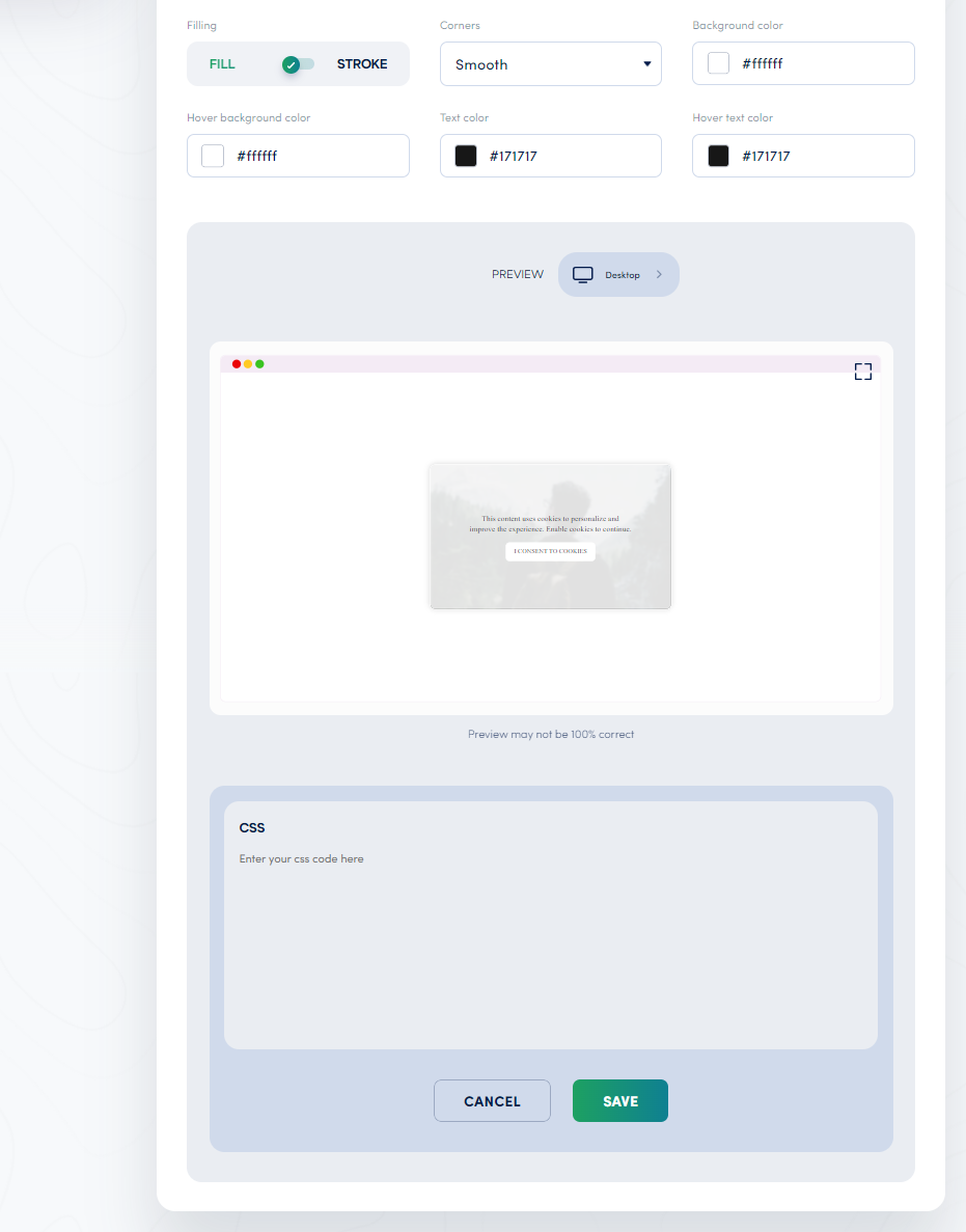
Custom CSS for Contextual Consent Pages
The Custom CSS panel gives developers complete control over the contextual consent overlay's appearance. You can override default styles to match your brand's specific color palette, typography, spacing, margins, and more — beyond what the visual editor exposes.
Common use cases for custom CSS include importing a custom web font, adjusting overlay padding, modifying border radius, or applying animation effects. For guidance on using the Custom CSS panel, see How to Add Custom CSS for Improved Design and Branding.
Preview Across Desktop, Tablet, and Mobile
Once you have applied your design settings, use the Preview feature to see how your contextual consent overlay renders across desktop, tablet, and mobile screen sizes. Note that the built-in preview is approximate — for the most accurate visualization, switch to full-screen view before finalizing your design.
After any significant design change, also verify that all consent buttons still function correctly by testing the overlay in a live or staging browser environment.
Best Practices for Designing a GDPR-Compliant Contextual Consent Page
Meet WCAG contrast requirements: All text must achieve a minimum 4.5:1 contrast ratio against its background (WCAG 2.1 AA). Verify using WebAIM's Contrast Checker.
Use equal-prominence buttons: Style Accept and Decline buttons consistently — same size, weight, and visual prominence — to avoid dark patterns prohibited under GDPR.
Keep message text concise: Users are more likely to engage with short, plain-language consent text than with lengthy legal copy. State what data is being shared and why in as few words as possible.
Test on real devices: Supplement the built-in preview with testing on actual mobile devices to confirm touch target sizes, readability, and button responsiveness.
Review after every CSS change: Run an accessibility check using Axe Tools or WAVE by WebAIM after applying custom CSS to ensure no accessibility regressions have been introduced.
Frequently Asked Questions (FAQ)
Where do I find the Contextual Consent design settings in Secure Privacy?
Go to Design in your Secure Privacy dashboard, select your template, and navigate to the Contextual Consent section. All background, text, button, and custom CSS options are available there.
Can I reset my contextual consent design to defaults if I make a mistake?
Yes. The Reset option in the Contextual Consent design editor reverts all settings back to Secure Privacy's defaults. This is useful if custom changes have produced unexpected results and you want to start from a clean slate.
What contrast ratio should I use for my contextual consent overlay text?
WCAG 2.1 AA requires a minimum contrast ratio of 4.5:1 for normal text against its background. Use the WebAIM Contrast Checker to test your color choices before publishing.
Can I apply custom fonts to the contextual consent overlay?
Yes. Use the Custom CSS panel to import a web font (e.g., from Google Fonts) and apply it to the consent overlay using the appropriate CSS selector. See the guide: Customize Cookie Banner Design — Secure Privacy Guide.
Does my contextual consent overlay design need to be GDPR compliant?
Yes. The design of your contextual consent overlay must not use dark patterns. This means the Accept and Decline options must be equally prominent — the same size, weight, and visual treatment. Styling that makes accepting significantly easier to see or click than declining can constitute a GDPR violation.
Conclusion
Secure Privacy's Contextual Consent design editor gives you full control over how your consent overlay looks and feels — from background and text colors to button styles and custom CSS. By investing in a clear, branded, and accessible contextual consent design, you improve user trust, encourage transparent consent interactions, and maintain compliance with GDPR and WCAG requirements.